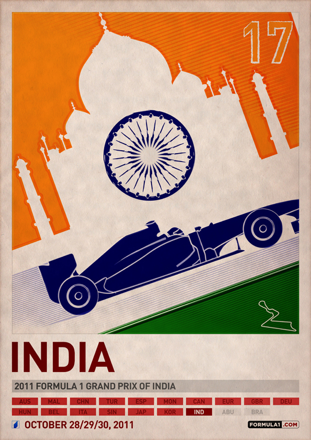
 "India" Formula 1 Poster Series by PJ TierneyI can't recall exactly how I came across PJ Tierney’s 2011 Formula 1™ Poster Series; it’s almost as if they’ve been a part of my memory for some time. When I started pinning F1 items on Pinterest, I knew I wanted to include his work. I remembered seeing his set of posters for the 2011 Formula 1 World Championship season – India was my favorite – and with a little digging I was able to attribute him to the original design and discovered his website – www.PJTierney.net.
Seeing that we’re just about one month away from the 2012 season, I reached out to PJ to learn more about his inspiration and his plans for 2012. Also, I thought that fans of his work, including many American racing fans, would like to know if there are plans for an F1 poster for the USA. Great news folks: PJ’s online store is launching today.
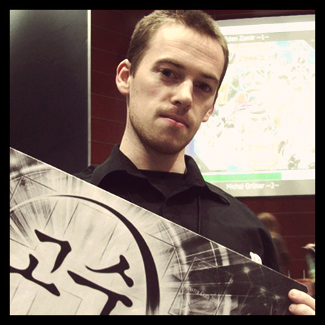
PJ resides in Ireland and graduated from Limerick School of Art and Design in 2010 with a degree in Sculpture & Combined Media. For the majority of his four years at Limerick his work focused on video games, as that's his major pastime when he’s not working on projects. It was there that he first came across the Adobe Creative Suite, and he spent every spare minute he had in the Multimedia Rooms playing on Photoshop and Illustrator. As of now he’s working from home, just outside of Limerick city (in the West of Ireland). PJ works freelance which allows him to take on projects from clients when they need them and work on personal projects, like the F1 series. He’s also an avid blogger and player of the Yu-Gi-Oh! Trading Card Game, having worked with the game's distributors (Konami) on various projects: writing for their official strategy site, working as a member of the European coverage team and providing live updates from events in places like Paris, Milan and Amsterdam.
As far as his design style goes, PJ likes to keep things clean and organized, and always tries to take the minor details into consideration. It's not unusual for him to be working on (Adobe) Illustrator with the canvas zoomed in to over 500% in order to make sure everything's in the right place. He continues:
“I was never a fan of clutter and when I was earning my degree I hated getting my hands messy with paints and so-on, which lead to me moving to digital art. That being said I don't feel that I have one particular "style," as limiting oneself to one way of working can get boring after a while. I like to try out different things to keep the interest levels up, be it a vector illustration, some basic 3D work or whatever else springs to mind.”
PJ draws inspiration from a wide variety of things. He’s active on Twitter and works to surround himself with fellow designers and artists everyday. He says, “It's good to see what projects they're working on, what they think of the work that's out there and so-on. That keeps me in the mindset of making things and is a great motivator.” PJ also checks in with a daily digest of design sites, often spending 30 minutes or so looking through them all at once. Sites like Abduzeedo, Signalnoise, From Up North, Other Focus and My Modern Metropolis are constantly updated, offering inspiration everyday from what others are making.
So why has PJ focused on F1? He says it’s hard to pinpoint one single thing: he loves the shape of the cars, the noise, the “sheer speed they can take corners at, all of that.” There's also the drama off the track, the stories you hear about drivers and teams (“though the whole Lotus v Lotus thing felt a bit ridiculous”), the technical innovations and the general spectacle of it all:
“When you watch a Grand Prix weekend from start to finish you really get a sense that this is a grand occasion, that the whole world is watching, and it happens 20 times a year.”
Why F1 and not something else? It could simply be because he grew up with it. PJ’s first F1 memory was seeing Martin Brundle's Jordan fly upside down into a gravel trap at Melbourne 1996, and he’s a big fan of Michael Schumacher and the way he approaches races.
Having an Irish team in the sport at the time helped, and when Jordan started winning in 1998 and 1999 he was glued to his TV set, even in the middle of the night to catch the Asian races – a sentiment the die-hard American racing fans can definitely relate to. He also says that it helps that F1 is more accessible than other forms of motorsport, though he plans on watching a few more special events this year like LeMans and the Nürburgring 24 Hours. PJ watched the Indy 500 (online) for the first time last year and notes “it was an exciting experience (shame about Hildebrand though, he was so close).”
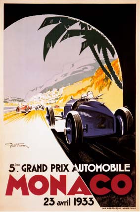 Vintage Monaco Grand Prix automobile Ferrari racing 1933 advertising poster, by George Ham
I was curious if PJ was inspired by the iconic 1930’s Monaco racing posters, put he explains there were many things that influenced his F1 poster series: the vintage racing posters is certainly one of those, as he loves the illustrative style of them, backed up by powerful lettering. PJ explains:
“One of the main influences in the layout of the original F1 poster series (2011) was actually the F1 2010 video game by Codemasters. That game's user interface had a very powerful usage of DIN Pro, the typeface you see across all the official Formula 1 graphics.”
Outside of motorsport he’s a big fan of the work of James White, and when the TRON: Legacy film was in cinemas James created one poster every day, counting down to its release. PJ did the same for his F1 posters and created one poster everyday for three weeks leading up to the 2011 season opener in Australia; he says the quick turnaround time helped keep his mind busy and that “it was fun to find creative solutions in a short space of time.”
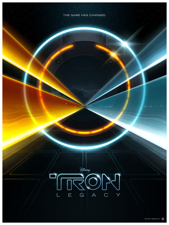 TRON: Legacy poster, by James White
I was pleasantly surprised to learn that the response to PJ’s F1 posters has been “massive.” He originally created the posters just to give him something to do and to learn a bit more about Adobe Illustrator, and he was amazed when various websites started to feature his work. He heard from people as far away as Malaysia and Brazil that were saying: "Hey, check out these posters if you like F1" which was incredible. People liked them so much that he was constantly being asked about selling them, and once he did the orders came in right away. One thing a lot of people told him was that they liked picking up their home country's poster, and they thought it was interesting how the flags and cars interacted with each other. For the 2012 series he focused entirely on the flag portion of the posters, and it seems to have gone down well with people. Regarding promotion; it's all online. Ireland's “a very small place and ever since Jordan Grand Prix left the sport in the previous decade the sport hasn't been as popular over here, compared to soccer, rugby and Gaelic games.”
But it’s not just web-based sales that have helped PJ with his F1 poster series: without social media he wouldn't be where he is today. As mentioned above he’s quite active on Twitter, and he explains that it’s free from the clutter that one finds on Facebook, which makes it easier to “get into.” When he put the original series together he uploaded one picture a day, and by the end of the series people were "tuning in" to see what he would do with the Indian flag, or the Brazilian one, or what Japan's one would look like – “That was a fun experience,” PJ recalls fondly.
Once his F1 poster series launched they got picked up by various Formula 1 and design blogs, and people often linked back to them around the time of each Grand Prix. Speaking of, he created a set of banners incorporating the posters for one of his favorite F1 blogs, F1 Fanatic. That site produces an unofficial race program on the Thursday of each race weekend with links to everything from the TV times to driver interviews, and he'd often see people commenting on the banner as well as the race itself. PJ also post updates to Facebook and has his own personal blog where he shows people what he’s working on, as well as some of the cool stuff he finds online.
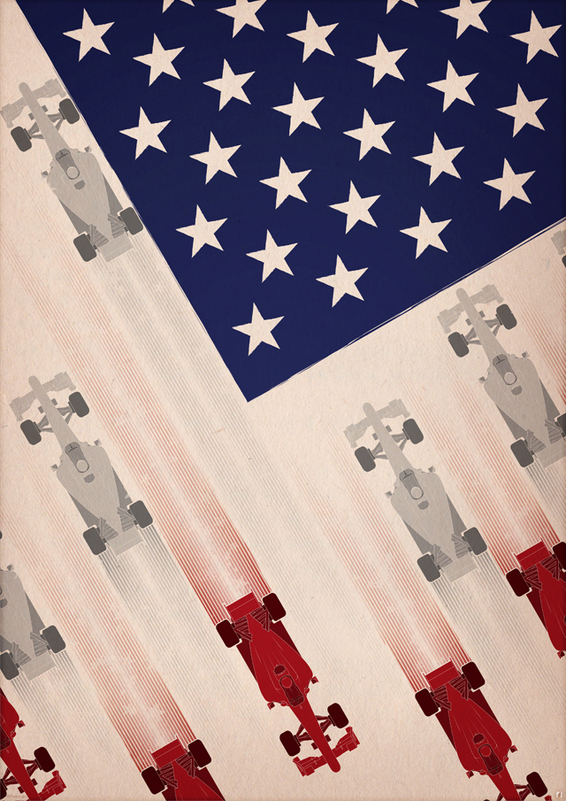 "USA" by PJ TierneyWe enjoyed learning more about PJ’s process and inspiration and how F1 has affected him as an artist. We hope you enjoy his work as we have; we believe the F1 poster series will remain a design standard in F1 for some time.
PJ’s 2012 F1 race series posters will launch today at 8AM CST (2PM GMT). The posters can be picked up via his site, www.PJTierney.net or Shop.PJTierney.net. The majority of them come in 2 sizes; A2 (close enough to 18" x 24") and A3 (about half that). You can also follow him on Twitter, Facebook or check out his blog.
PJ wants to thank everyone that’s supported him over the past year: “it means a lot!” He also wishes us the best for a great 2012 US Grand Prix; we hope he can make it across the pond by November for the Inaugural Formula One United States Grand Prix!

